
This Week from the Desk

Tazugane Gothic was released this week as a "Japanese Humanist Sans Serif Face". This is the first Japanese font family for Monotype. It's a sharp looking offering in 10 weights that continues the trend of globalization for Monotype. View the full family page here.

The famed design and object trade show held in Paris every year happened this week. It was filled with the cutting edge of everything from furniture to jewelry to pencils to kitchens.... the list goes on. It's worth taking a look at the exhibitors, articles and highlights coming out of the international affair.

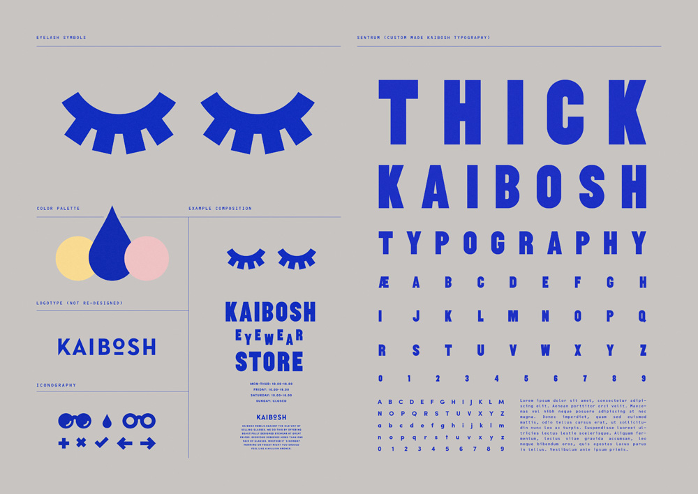
Kaibosh, an eyewear brand designed by Snask, now has the top spot for best original branding project of the year. There's so much to this, it's fun, and effective design. Love it. Brand New's profile shows it best.

Its a symphony of parts! Typofonderie's Prosaic is a constructed sans serif family in 9 weights and italics that offers a welcome counterweight to the foundry's broad and traditional French repertoire. It's introduced to us as a "postmodern vernacular sans serif" with some images of it's theories to boot. It feels very designed, digital almost, but I think that's where its charm comes from.
A closer look a the work of Spencer Fenton. Slick is right. (via It's Nice That)
RoandCo Tumblr

If you're looking for a new superbly curated stream of images, look no further, RoandCo is here.